The web is full of resources telling you to use the relative lengths “em” and “rem” over pixel, because they would make your design more accessible. Almost all Front-End Developers I know (including myself) were blindly following these instructions for years and it became a de facto standard in the industry. I’ve done some research lately that completely changed my mind about these two relative units. I won’t use “rem” going forward and only use “em” in very specific use-cases. In this article I’m going to share my observations and hopefully convince you to put an end to our beloved “rem” unit, that finally made it into our tools without fall backs (given IE8 dying slowly), but became totally useless in favour of the more popular CSS reference pixel.

The “em” unit has its origin in typography and it was used as relative size in relation to the font size of a given type. Back in the days, print was all about letterpress typesetting, where letters were stamped onto paper using metallic so called quads (originally quadrat). These quads were all of the same height and could fit every letter of the alphabet for a given size and type. However, they varied in their width, and because the upper case letter “M” was always very close to equal in width and height, the convention to use the width of “M” as relative unit established. Thus the origin of the unit name “em” as it’s just the phonetic representation (ɛm) of the letter “M” (I couldn’t find any historical proof for this derivation, but people seem to agree that this is the most logical explanation).
Computers are all about pixels and when the “em” length was introduced with CSS 1 back in 1996, its main purpose was to bring a unit that’s relative to the font size in a given context. The specification says:
The relative units ’em’ and ‘ex’ are relative to the font size of the element itself. The only exception to this rule in CSS1 is the ‘font-size’ property where ’em’ and ‘ex’ values refer to the font size of the parent element.
In the beginning “em” was a nice addition to CSS and it allowed to build a design that was sensitive to your content. You could size text of sub-elements relative to parent elements or do things like specifying your padding with “em” to ensure you have a larger padding on your text container than your word space (conforming to the visual rule of proximity).
Another use-case, which was the main reason “em” became very popular, was for accessibility reasons. Its nature of being relative to the root of the DOM (while following the constraints mentioned below) made it perfect for resizing your whole design on user preference. Browsers supported to change the default font size which then changed the calculation of “em” units in your whole website.
But there was a rather large downside to “em”. Like outlined in the specification, it it’s inherited and if you have multiple nested elements that override the font size in “em”, you’ll need to go through some math exercises every time you want to calculate the actual font size somewhere deep down in the DOM.
Let’s illustrate this problem quickly by looking at the following code snippets:
<div class="level-1">
  <div class="level-2">
    <div class="level-3">
      <p>Hello!</p>
    </div>
  </div>
</div>
html {
  font-size: 20px;
}

.level-1, .level-2 {
  font-size: 0.5em;
}

.level-3 {
  font-size: 2em;
}
What’s your take on the font size of the text “Hello”? As the “em” value changes with the cascade and nesting of the DOM, it’s really hard to keep track what’s going on. The text in this example would be 10px in size as the initial 20px on the html element is multiplied by 0.5 two times before it’s multiplied with 2 again.
REM, the Super Hero of the Units!
Finally with CSS3 there was a solution to the above problems. REM stands for “Root EM” and literally refers to the “em” size of the root element. The root element being your html element in the context of web documents.
This was simply fantastic! We could use relative font sizes for accessibility but still avoid the mess of having a nested “em” structure. Almost every developer adopted this new and fancy CSS length unit and it became very popular.
The only problem with it was missing IE8 support. Since the second draft of CSS3 in 2005, REM was not considered to be important enough to be included in the 4 years later released IE8. Anyway, as we know how to work around IE issues, we started to use the REM with pixel fallback pattern.
.my-text {
  font-size: 32px;
  font-size: 2rem;
}
Gentle, how CSS is, it was always built on the concept of graceful degradation. If the rendering engine does not understand a property or value, it simply ignores it. That led to modern browsers favouring the “rem” bit over the property specified above with “px” and older browsers just ignoring the later line specified with “rem”.
The Mobile Age
We are living in a mobile age today and this changed the internet from both ends, how we consume it and also how we build it. Responsive web design became very popular and probably the most used buzzword ever. While already specified in 2010 by Håkon Wium Lie, the media query module entered the CSS3 specification relatively late in the working draft 8 which was the last call working draft at the same time.
Media queries are an asset every front-end engineer is aware of today and we use them almost on every project to some extent. When they became popular and people started to design their web sites for mobile devices it didn’t take long until some debates started whether to use pixel or relative font units “rem” or “em” to specify media queries. Let’s take a look at Zurb’s responsive CSS framework Foundation 2 that was released in October 2011:
/* Mobile */
@media only screen and (max-width: 767px) {}
/* Modernizr-enabled tablet targeting */
@media only screen and (max-width: 1280px) and (min-width: 768px) {}
You can see that in this desktop first approach everything between 768px and 1280px was considered a tablet (with a modernizer enabled touch selector) and everything below 768px was considered a mobile (phone).
What you can observe as well, is that pixel units were used to specify the media queries. Let’s take a look at a more modern version of Foundation. Foundation 5 was built mobile first and uses “em” based media queries for all screen sizes.
/* xs up */
@media only screen {}
/* small up */
@media only screen and (min-width: 40.063em) {}
/* medium up */
@media only screen and (min-width: 64.063em) {}
/* large up */
@media only screen and (min-width: 90.063em) {}
/* xlarge up */
@media only screen and (min-width: 120.063em) {}
If we assume the browser default font size is set to 16px and calculate our “em” based on this then those media queries would be computed to 640px, 1024px, 1440px and 1920px.
At first glance this makes a lot of sense since now we have media queries that are based off the root element font size, which means our media queries scale with the browser font. However, there are plenty of issues with using “em” or “rem” in media queries as you will see in the conclusion section.
The Raise of High DPI
A few years ago pixels on screens were very clumsy large squares you could easily spot an arm length away from your 17’’ monitor that was running on XGA (1024×768) resolution. With increasing screen resolutions and the harmonization that came with HD video, it’s not only about resolution anymore. It’s clear that user interfaces on very large resolutions get hard to handle as the objects on the screen get very tiny.
In order to cope with this problem, operating systems and software user interfaces introduced a scale factor (in web development referred as device pixel ratio) that will actually be used to calculate a virtual pixel in the software. You can imagine that the user interface is actually rendered larger as it would be normally. Most of the modern smart phones today have a device pixel ratio of at least 2 which actually means that they are not 320px in physical width but 640px. Still, the operating system on your phone knows that it needs to render every element twice as large to compensate your viewing. Terms like physical pixel or device resolution refer to the real amount of pixel that are available on the device while the virtual size is often referred as logical resolution.
In CSS this problem was actually already addressed in version 1.0 back in 1996. The following quote from the W3C specification of CSS1 describes the CSS reference pixel angle.
Pixel units, as used in the last rule, are relative to the resolution of the canvas, i.e. most often a computer display. If the pixel density of the output device is very different from that of a typical computer display, the UA should rescale pixel values. The suggested reference pixel is the visual angle of one pixel on a device with a pixel density of 90dpi and a distance from the reader of an arm’s length. For a nominal arm’s length of 28 inches, the visual angle is about 0.0227 degrees.
This is the second time I was surprised about the technical vision the guys at Opera already had in mind when specifying CSS1. My first surprise was the vision about media queries they already noted down in the specification about @media in CSS1.
Future versions of HTML may introduce new values and may allow parameterized values. To facilitate the introduction of these extensions, conforming user agents must be able to parse the media attribute value as follow:
The value is a comma-separated list of entries. For example,
media=”screen, 3d-glasses, print and resolution > 90dpi”
This was 1996 guys! They probably met “Doc” Brown from “Back to the Future” and he told them about Oculus Rift…
So that’s great then! We have operating systems that can scale user interfaces and we have the web that can scale web site content with the use of the reference pixel. Why am I telling you all this!?
The truth about accessibility and todays browsers
In order to understand the need for the “rem” unit we need to go back in time a bit. By back in time I mean that time when desktop screen resolutions were roughly 1024 pixel in width and our preferred browser was IE6. Hand in hand our preferred web font was Tahoma or Verdana with a size of 10px. No joke that was state of the art, if you didn’t happen to have the chance to enjoy this!
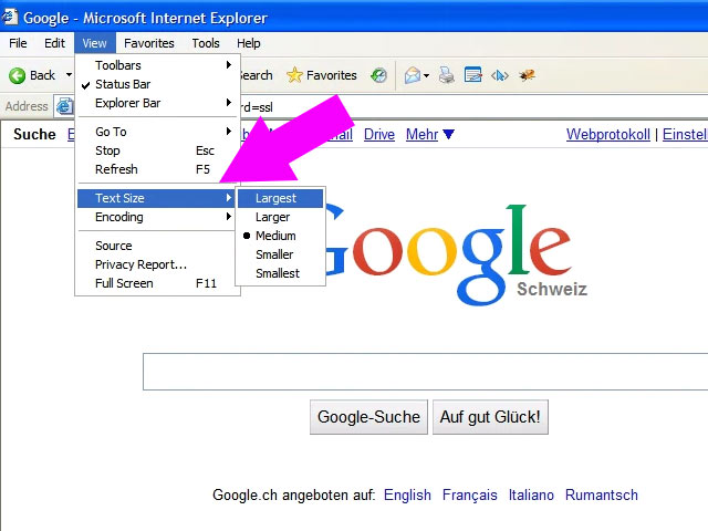
At that time the most common way to enhance accessibility for poor-sighted people was to scale your web sites text size. In IE6 you could go to your view settings and from there you could change your text size from normal to large or extra-large. This had a direct effect on your browser default font size (which was 12pt in IE6) that is inherited to the html element. Back then we have used “em” to style our content so if a person with disabilities was changing the default font size, they got the whole website scaled instantly.
However, that was 2001. Devices have evolved and so have browsers and operating systems.
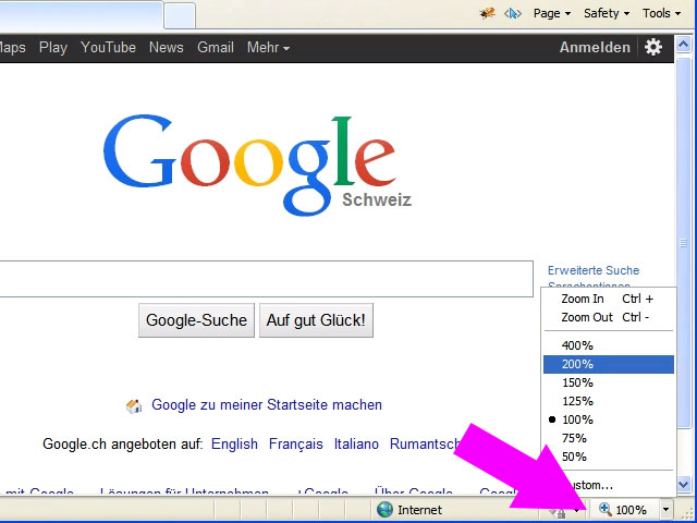
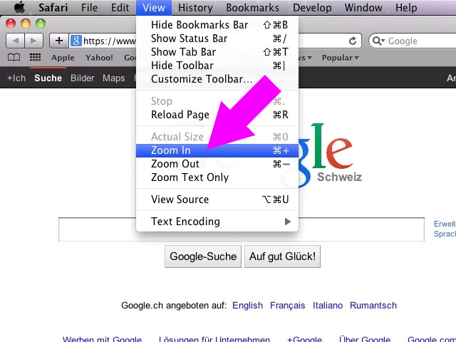
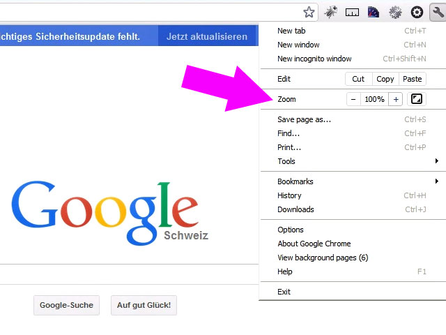
At the time when the “rem” unit arrived to fix the problems discovered with “em”, it also became irrelevant because now we have a widely adopted reference pixel that is easily controllable by the user. The new magic technique is simple zooming. In version 7 of internet explorer that was released in October 2006 there was a very prominent zoom icon on the bottom right of the browser window. And guess what… The zoom function was just modifying the CSS reference pixel in the browsers CSS rendering engine! What a breakthrough! And to give you the full picture I’ve put together a screenshot gallery from old browser versions with some annotations on how they handle this specific accessibility issue.


As you can see, even Stone Age browsers don’t promote user agent default font size change anymore. They promote the zooming function (CSS reference pixel) over the text size change. And this makes absolute sense. If you change the reference pixel size, you change the entire design, making everything larger and not only lengths that were specified with “rem” or “em”.
An other fact that plays into accessibility are the system wide settings that get reflected down to applications. A person with disabilities will most likely change his operating system accessibility settings permanently. In Windows, a user can change his DPI scaling settings to something above 100%, which is very similar to the CSS reference pixel in the browser. It will cause the operating system to scale object and user interfaces where possible. It also notifies applications about the increased DPI scale factor. And guess what? The browsers will use this DPI scale factor to influence the CSS reference pixel, so it appear that there is a default zoom applied in the browser. This is one reason more why the “rem” unit is mistakenly praised to be an accessibility hero!
Conclusion
If you are still using “rem” or “em” for accessibility purpose, stop using them immediately! They are completely counter intuitive and just introduce another level of abstraction that is no longer needed. You’re never sure what the root element font-size is and you need to do math in order to get something you can relate to (pixel).
Our minds are trained in pixel and that’s how we process images and work with user interfaces. We are soon living in a DPI independent world where virtual pixels and logical screen resolutions will be everything we need to be concerned about and for the web this is true since 2006 (even earlier if browsers would have adopted earlier)!
So please do yourself a favour and trash your “rem” lengths and use pixel instead! The best practice today, which is also obvious due to the promotion and placement of today’s browser user interfaces, is to use the zoom function if you are visually impaired. This will change the CSS reference pixel and the whole page will be zoomed including your pixel length, “em”, “rem” and everything else too.
As far as “rem” or “em” in media queries go, I’m completely against this and found it even more counter intuitive. The problem there is that “rem” as well as “em” don’t refer to the root element (html) but to the browser defaults directly which can only be changed using the browser settings for base font size (which in modern browsers, is hidden in the advanced settings). This means that even if you specify a font size of 30px on your html element, media queries will still use 16px as “em” / “rem” based for the media queries unless you also change your default font size in the browser settings.
It’s also important to know that when zooming into a page and modifying the CSS reference pixel, the media queries specified in pixel will also use the reference pixel to compute the actual amount of pixels. This is not the case if you use device-width in your CSS media queries, which refers to the physical pixel without taking CSS reference pixel into account. However, I see no valid reason where device-width should be used instead of width (or min-width / max-width).
In order to experiment a bit and do cross browser sanity checks I’ve created this simple test page on JSBin. As you can see when zooming in, the media queries in pixel behave the same way as “rem” based media queries.
There are some very specific use cases where the use of “em” actually still makes sense. If you’d like to use a relative length to a components font size, from a visual standpoint, then “em” makes absolute sense. But for “rem” I can’t find one valid use case anymore. If you can prove that I’m wrong I’d be more than happy to hear your opinion.
I think that good example is Google search results. They used rem only for some text and elements. All other elements is in px.
When user change text size in browser settings they change only for main text etc, but not for all elements on page.
This can be compared to a script that allow you to change font size on page.
LikeLiked by 1 person
Great article! another thing I’ve noticed is that using REM is not accurate for Chrome with some foreign UI locale.
Take a look at this example: https://codepen.io/tonni_hou/pen/gGaQmb, the reason is because the minimum font-size you can have is 12px for Chrome with Simp/Trad Chinese, Japanese, Korea and Thai interface.
LikeLike
Pingback: Das muss etwas nach links … EM, REM oder PX? – NOVATREND Blog
Pingback: Users DO Change Font Size – Evan Minto – Medium | OntheWebIT.com - Website Development and Design
Pingback: Users DO Change Font Size | Pybugs Technologies
Pingback: Users DO Change Font Size – Evan Minto – Medium | Premium apps reviews Blog and Programing
Pingback: Users DO Change Font Size – QuiQ website
Pingback: Hướng dẫn biên tập – Khuyên đọc
Pingback: Hướng dẫn biên tập – Học Gia Tốc
Media queries don’t solve anything. Sure, you can use media queries to display the font larger or smaller based on viewport, but what if the user prefers things larger or smaller? As you point out, modern desktop browsers provide the option to zoom the page so the user can customize things for a given page or website. However, this option is missing from mobile browsers. Sure, you can tell your mobile browser to scale the font, but this is a global setting and doesn’t generally scale fixed fonts. 4 years after the proclaimed death of rem, most mobile users still don’t have good options to scale fonts for a given website or webpage to their preference. rem may be dead to you but is alive and well (or should be) for those designing for usability. I prefer to set the html root to a fixed px size (e.g. 10px), use rem for the rest (e.g. 1.6rem instead of 16px), and provide a font size button so users can scale to their device preference.
LikeLiked by 1 person
article so good I bookmarked and downloaded (just in case website ever goes offline)
LikeLike
I’m flabbergasted. Not being a professional Web designer myself, but having often to ‘fix’ other people’s bad designs, as well as adapt existing CSS to work with certain applications, I have always thought that
emandremwere the best way to deal with responsive designs… and I carefully kept changing all references in other units toemandrem…While we can all agree that defining a font size in CSS using
ptdoesn’t make sense except for printers, I wrongly assumed thatpxworked as it did on early versions of Photoshop and similar graphic tools: it measured real pixels, something which would have made sense in the days of ‘standard’ 640×480 VGA monitors back in 1987, but obviously not today. The whole idea that onepxactually corresponds to a ‘virtual pixel’ — which is even under the control of the user, not the hardware — is truly mind-boggling!Wow. I’m taking off my virtual hat to you. And this was written 6 years ago. I feel so horribly outdated now, and acutely embarrassed for having spent so much time complaining that designers were not using
em/rem…I guess that this is another case where RTFM applies!
LikeLike